Creation of the Jaguar XK8 X100
Ian Cooling reveals his insights into the creation of the XK8 we know today
AUTOMOBILIA XK8 GENESIS
THE GESTATION OF A CLASSIC
Ian Cooling shares his insight into the creation of the Jaguar XK8
Over the weekend of 16-17th August 1997, to celebrate their 75th anniversary, Jaguar took over the grounds of Town Thorns one of the care centres run by BEN, the Motor and Allied Trades Benevolent Fund near Rugby The XK8 had been launched the previous year and Jaguar’s design department mounted a special display that featured the creation of the XK8. Known internally by the codename ‘X100’. This was a rare and intriguing glimpse of the work of a department that usually operates discretely and often under the tightest security. The design lead for the XK8 was Fergus Pollock As well as displays of the interior and body colours, there was a superb range of concept drawings by the designers in Fergus’s team who created the interior and exterior of this car. These mainly illustrated the development of the body shape and interior concepts, but some sketches showed specific details like the dashboard. Most were reasonably worked-up images, usually in watercolour on art paper, but a couple were just rough sketches.
One intriguing element is the time-span. Several sketches are dated 1991, five years before the launch, other are from 1995, when the final shape of the car and its interior is starting to emerge. Many but not all, were signed by the designers and I am very grateful to Stuart Spencer, who was Jaguar’s Design Studio Manager at the time, for his help in identifying the signatures so these designers can be given due credit for their superb work in helping create what is now recognised as a classic Jaguar.
“...a rare and intriguing glimpse of the work of a department that usually operates discretely and often under the tightest security.”
Above left: Some hardware from the same display to close. These wall panels showed various interior colour schemes and the way interior panel lines were used to separate the colours.
Above: This panel was one of those showing different exterior body colours and different shades within those lead colours.
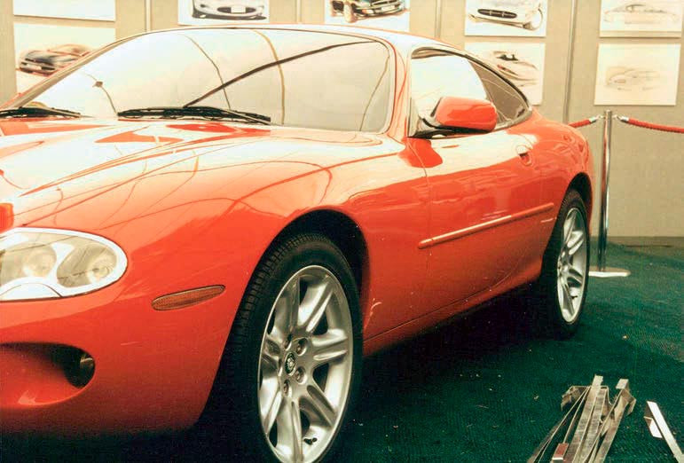
Left: This full-size car was the centrepiece of the XK8 display. Linked to the exterior colour panel above, it may have been one of the market research cars created by Futura Design. One of their principal functions was to try out various body colours and they were resprayed several times. These photos were taken the day before the displays opened to the public, so everything was still a bit rough-and-ready. However, the wall-display of the artwork discussed above can be seen beyond the car.
Two 1995 dashboard designs also by Gary Doy. The annotation says they are ‘driver bias’ and that is spot on. All the key instruments are in front of the driver with no wrap-round effect running across the full width of the car width of the car. It is a cliché about good sports cars that you don’t so much climb in as put them on. Having everything in front of the driver like this, would certainly draw the car round you as you settled into your seat.
This drawing by Daniel Steenstra sets the driver’s compartment more firmly into the car as a whole — and the car is a convertible. The XJ-style wood veneer dashboard runs across the full width of the car with all the instruments gathered together in front of the driver and a/c outlets in the centre. One intriguing feature is the streamlined panel behind the two headrests, and which appeared in a more exaggerated form on the XK 180. Did Daniel work on both cars, carrying this detail forward in his head from 1992 to 1999?
Two 1992 interior concepts from designer Mark Phillips. On the left is a sweeping console running across the full width of the car and with supplementary instruments and switches grouped centrally. The right-hand sketch shows sweeping wood veneers running across the dashboard and dipping down towards the gearstick. More than a hint of the Series 1 XJ here.
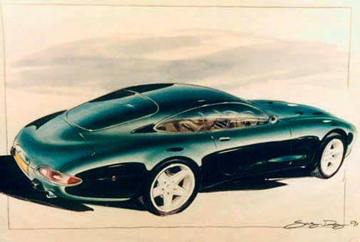
This is also a 1991 sketch by Gary and shows how much the rear end still had to evolve. The roof line flows over the rear window and extends across the boot lid and there is no sign of the lip across the boot lid that appeared later. The rear lights are shallower and with greater wrap-around. There is also no sign yet of that distinctive ‘bustle’ that was such a noticeable feature of the production car rear view.
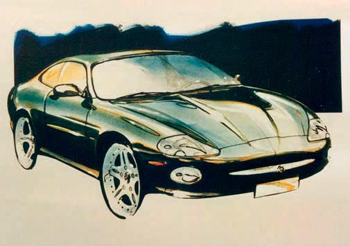
No date for Gary’s third sketch, but the final body shape is now clear. The shape of the bonnet is right, the headlights are exposed and the grille is deeper and set lower. The sidelights will see some fine tuning as will the bar across the grille, which is one of several styling cues that reach back to the E-type.

The first of the two rough sketches mentioned in the introduction. Undated, but probably later than the 1991 paintings above. Further development will see the back of the boot lid becoming more vertical and the rear lights will also receive more work. The headlights are uncovered and the sidelights are more deeply inset, in line with the production cars – see the red coupe over the page.
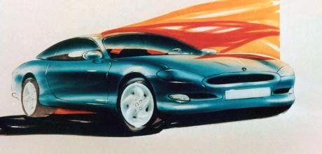
This sketch is the first of three by designer Gary Doy, dated 1991 and from the early stages of the design process. The basic sleek, fluid shape of the production car is already established — and it could not be anything other than a Jaguar. Changes will be made to the grille, which is shallow and set rather high. The headlights will be uncovered and the setting for the side-lights will not run under the grille.
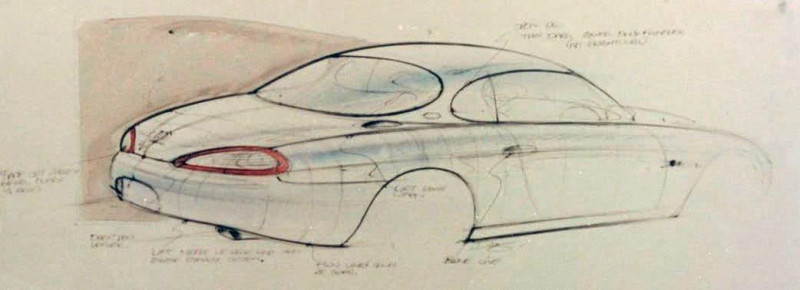
The second rough sketch, probably from the same designer but showing a very different rear-end concept. Both the boot and the rear lights are noticeably different. The ‘bustle’ below the boot is hinted, but not yet showing the firm panel and rear bumper line that makes it so distinctive on the production cars.


